QUOTE
“It was a day just like this, around 8 or so years ago,” a smile of nostalgia spreads across his face as Atif Azim, CEO of VentureDive, takes a sip of cold-pressed mango juice. “The four of us were hanging out after our day jobs in the Silicon Valley, and despite being friends since our days at Stanford, it was that day we realised we shared a common dream.”
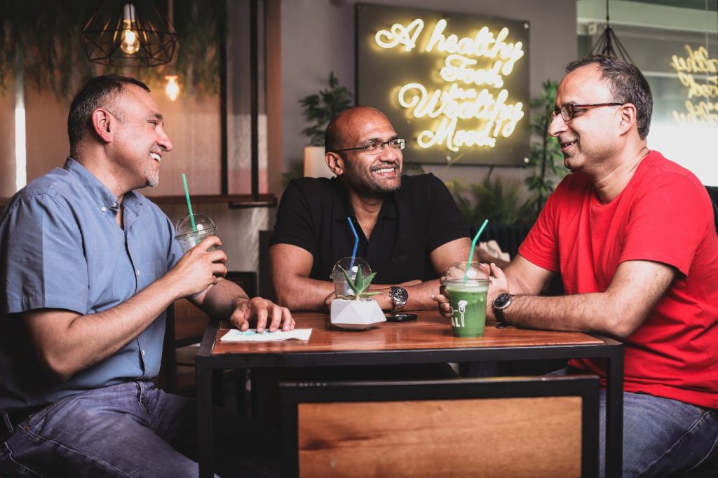
Lahore’s scorching sun is blazing through the window of the local cafe, as I enjoy the company of three of VentureDive’s co-founders. I had been asking them questions about the company, as part of a brand exploration I was doing with my team.
QUOTE
“The idea was to utilise Pakistan’s untapped technology potential, and innovate to improve lives, globally,” Shehzaad continued. “We started a venture fund. Some of the earliest ideas were weak, but we kept at it,” adds Saad. “Soon we became involved in the brainstorm for Careem. Shortly afterward, IslamicFinder became a part of our adventure too, and there was no looking back.”
As I listened intently in their comfortable presence, watching them share anecdotes, cracking inside jokes, and laughing, I couldn’t help but appreciate how rare it is to come across such emotions and affiliations in the technology and business world. Yet, at VentureDive, this culture, passion, and purpose have trickled from the founders all the way down to the roots of the organization. This, right here, is VentureDive’s identity.
Technology meets care
What happens when technology meets care? Truly inspired solutions spark to life.
It is simple, really. Yet, despite the IT industry being saturated with technology solution providers, businesses are still yearning to connect with an innovation partner that actually and truly cares about solving their problems.
VentureDive combines cutting-edge technology, design, and strategy with everything that is human — empathy, care, and friendship. We are continuously and relentlessly ‘innovating to improve lives’.
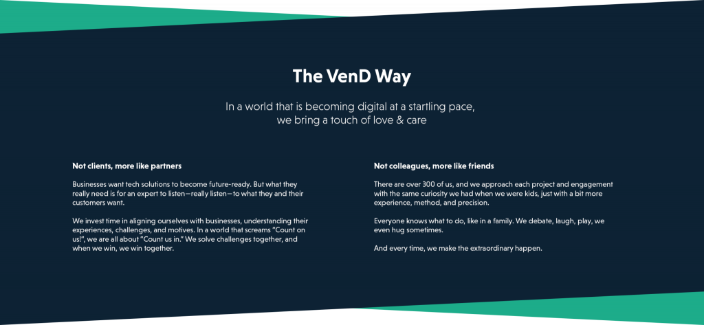
Why Rebrand?
Simply speaking, our existing brand identity did not sing our story anymore. There are three important aspects of our brand that have evolved.
Firstly, VentureDive’s portfolio of services has expanded. While we began as a tech startup with expertise primarily in Platforms and Mobility, we are now a full-service technology, data, design, and consulting organization. In addition to being a one-stop Mobility shop, we are actively working in the FinTech, HealthTech, and Cross-Reality (AR, VR, MR) space. Our Discovery Workshops, including Product Design Sprints, Prototype Development, and Business Case discovery, have helped numerous MNCs reduce the risks inherent in successfully bringing products to market.
Secondly, for over 300 innovation experts that make up this company, VentureDive has become much more than a workplace: it has become an institution for inspiration, learning, growth, and well-being. With the launch of VenD Labs, VenD Learn, and many more upskilling initiatives, VentureDive is fast emerging as one of the best workplaces in Pakistan.
Thirdly, as VentureDive grew, our design elements, personalities, and narratives started to grow also — but in different directions. Whether it was font usage, color palette, graphic styles or tone of voice, our identity started to become incohesive, inconsistent, and indistinct:
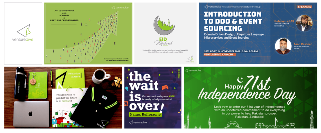
Speaking more specifically about design elements, the most evident problem was with our logo:
- It was not scalable: Construction using fine lines posed serious challenges in terms of visibility, a problem further aggravated due to the usage of colors that lacked depth and contrast.
- It had incorrect capitalization: VentureDive was incorrectly written in the logo, with a lowercase V & D.
It was easy to fix line weights and colors and try to make it work, however, the vision was to highlight our story (The VenD Way) through our branding. Hence, we embarked on a journey to rebrand.
Staying True to Ourselves
The honest to goodness heart and soul of a company are always found in its origin story. We started uncovering our story by talking to various roles of people at VentureDive and asking them key questions: How does VentureDive improve lives? Why should the world care about our brand? Who should care about our brand? What is our brand promise?
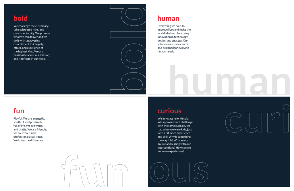
As our story revealed itself to us through answers collected from interviews, we identified 4 key aspects of VentureDive’s personality to bring to life in our new identity:
The Result
We translated these findings into a gamut of logo iterations, that converged into a logo we instantly fell in love with.
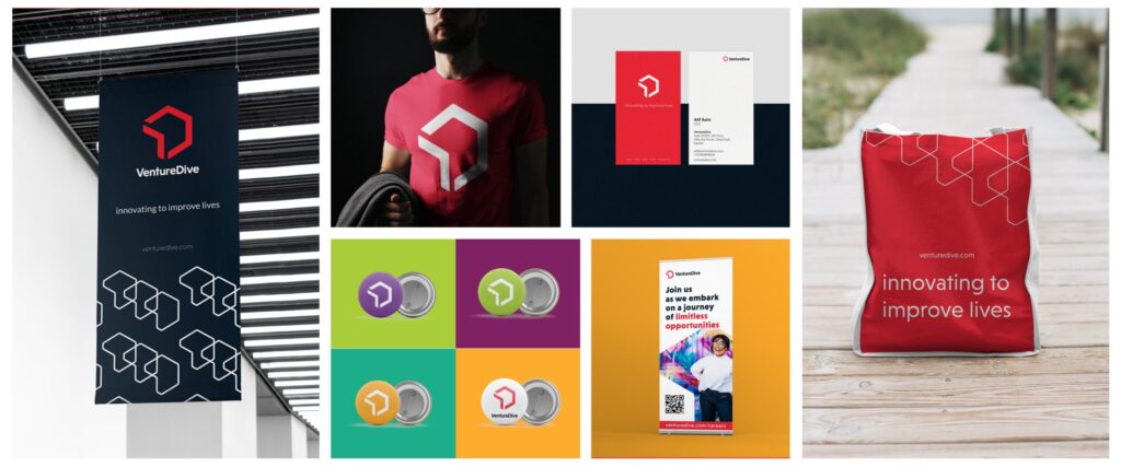
Naturally, we were drawn to the hexagon. A shape that has the unity and extensiveness of a circle, as well as the definitive angles of a polygon, the hexagon is arguably one of the most sacred symbols of geometry. It symbolizes harmony, balance, and empathy. For us, the message to be conveyed was clear. VentureDive brings a balance between the two extremes: technology and empathy. Our “onwards & upwards” mindset is perfectly embodied by an upwards tilted arrow. Thus, the Vengon was born.

Our color palette mirrors our balance, with a combination of dark and bright colors. The dark shade of blue we call VenD Promise, exudes trust and stands for the excellence of our craft, while the bold red called VenD Passion stands for our energy and the human connection with our customers and our people.
For the secondary palette, we continued with a set of vibrant colors that can communicate our brand message clearly.

The end result is a scalable brand identity that is a true reflection of our vision, mission, craft, and values.
The Future
VentureDive’s rebrand took almost 10 months, with cross-site teams working across design, marketing, and communications. It was a labor of love — but, quite understandably, no easy feat.
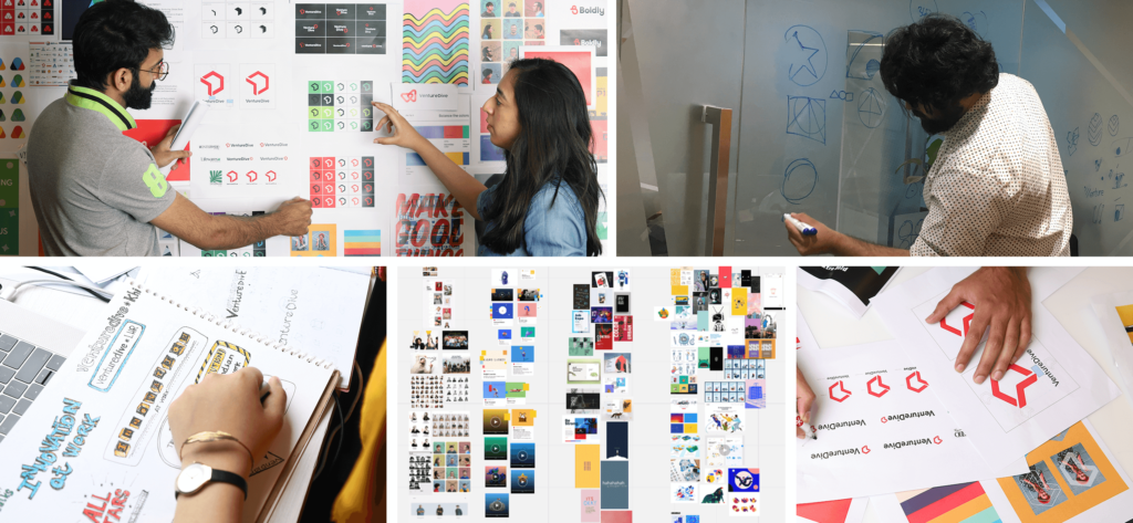
We are grateful to the entire VentureDive family, including our customers and partners, for your feedback, critiques, words of encouragement (and bear hugs, when we needed them the most)!
This is just the first step for us. As a living, growing, ever-evolving brand, VentureDive will continue to iterate, innovate, and improve. In the coming months, we are expanding our brand guidelines further and you will see all our collateral aligning around our fresh new look. Please stay tuned, and thank you for being with us on this journey.


